The NGO Project: CTCL Cumulative Grant Value Analysis
The NGO Project: CTCL Cumulative Grant Value Analysis
CTCL Grants Clearly Benefit D Counties

Introduction
If you are unfamiliar with my prior work on this topic, please read this article first.
I was struck recently by the desire to look at my CTCL grant data set a bit differently and ask these series of questions:
If I sorted the data by total D votes cast in the 2020 general election in descending order, how would the CTCL grant money be distributed?
How many counties would it take to accumulate 25%, 50% and 75% of the total grant value?
What would each of those increments correlate to in terms of cumulative votes cast for all parties?
What would the D/R ratio be for that set of counties?
Would it show a decided tilt in distribution of the grants to D counties?
That is what this article is about.
Chart Descriptions
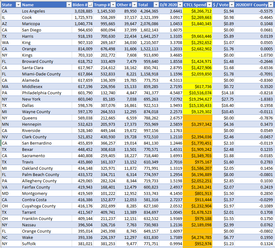
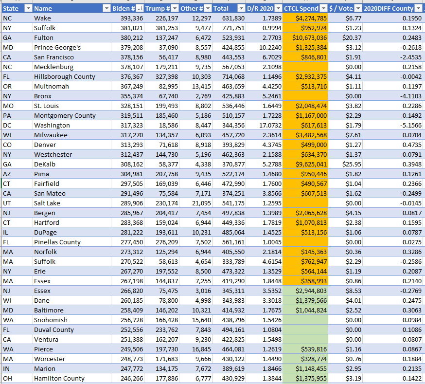
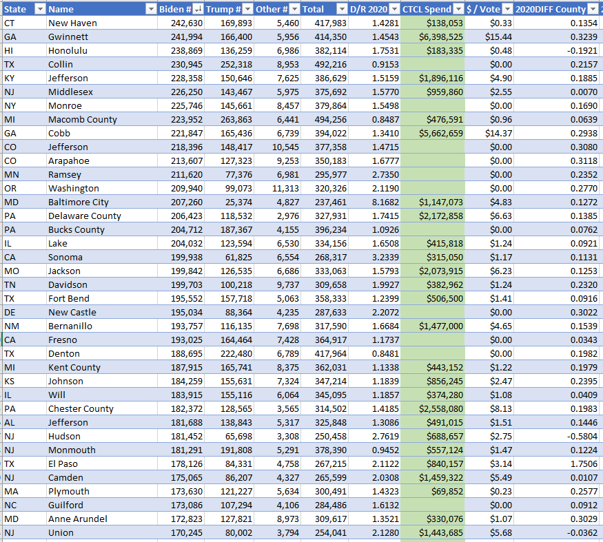
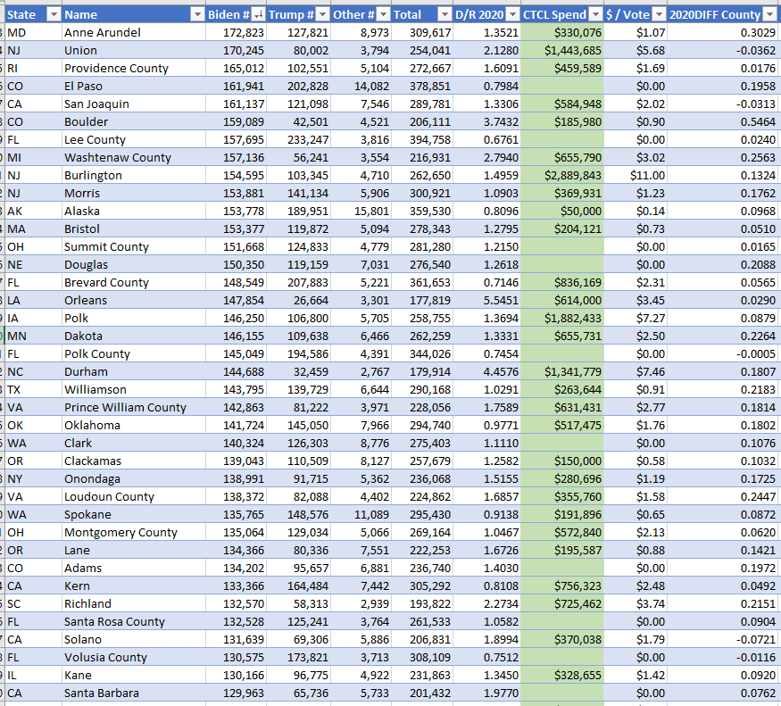
The analysis is based on these three graphs. I started by sorting my table of CTCL grant data in descending order based on the number of D votes in a county in the 2020 Presidential election (super important!).
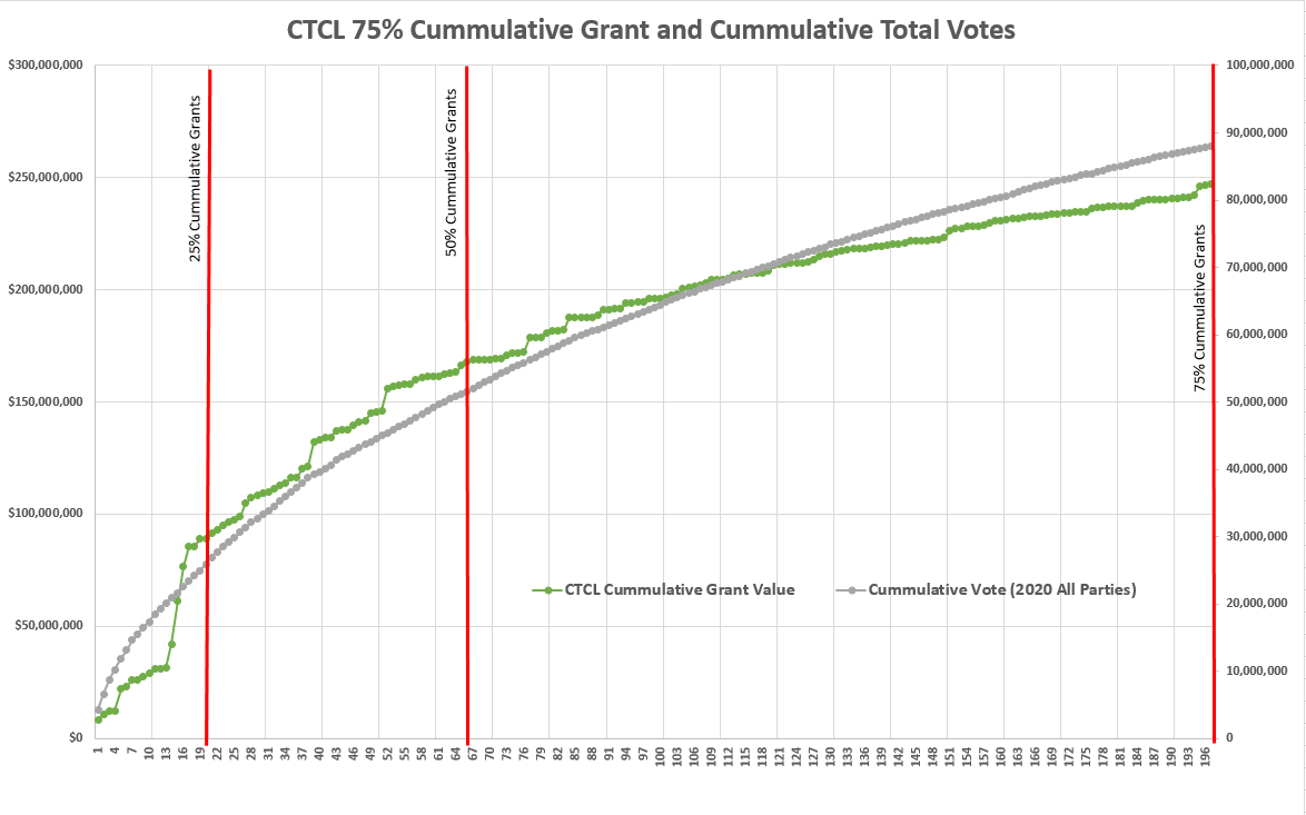
The data to support this graph is sorted in descending order from left to right based on the number of D total votes per county. I included both CTCL and Non-CTCL counties. The county with the highest total number of D votes is #1. The county with the lowest number of total D votes is #197. See the Reference section for details.
The grey line is cumulative votes *for ALL parties*. This is read on the right y axis.
The green line is the cumulative value of the corresponding grants up to ~ 75% of all the grant value distributed. I included counties which received no CTCL funding which accounts for the “flat sections” on the green line. This is read on the left y axis.
The red vertical lines indicate where ~ 25%, ~50% and ~75% of the total CTCL grant value lines up to the number of counties needed to reach that %.
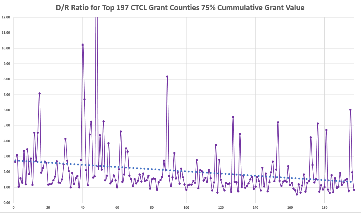
This chart is for the exact same 197 counties in the same order but instead reflects the D/R cast vote ratio which is the purple line. The blue dotted line is the linear trendline.
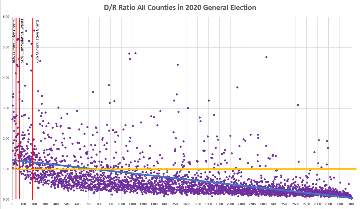
Finally, the last chart is the D/R ratio for *ALL* counties in the 2020 Presidential election sorted from county with the largest number of D votes to the smallest left to right. The gold line represents a D/R of 1.0 meaning all D leaning counties are above the line and R leaning counties are below the line. The blue line is the linear trend. As expected, the fewer votes you have in a county, the more R it is generally speaking. The red lines are set at the exact same numbers as chart number 1 meaning 25%, 50% and 75% of cumulative grant value.
Analysis
What does all of this mean?
The tables to support these conclusions are listed in the Reference section.
25% of the grant value was spent on 15% of the total vote all parties defined by the first tranche (red line #1). 17 Counties (~0.5% of counties)
The non-weighted D/R average of that first 25% tranche was 2.75! This means ~ 2.75 D votes per R vote cast.
50% of the grant value was spent on 32% of the total votes all parties defined by the first and second tranche (red line #1 - #2). 64 Counties (~2% of counties)
The non-weighted D/R average of that first 50% tranche was 2.76!
75% of the grant value was spent on 55% of the total votes all parties defined by the first, second and third tranche (red line #1 - #3). 197 Counties (~6% of counties)
The non-weighted D/R average of that first 75% tranche was 2.05!
The remainder of the CTCL funds were spread out amongst some of the remaining 2,917 counties, not all received grant money.
The non-weighted D/R average of this tranches of 2,917 counties is 0.59 meaning heavy R counties.
Does all of this strike you as fair an in alignment with the stated purpose of providing these grants as listed on the IRS 990?
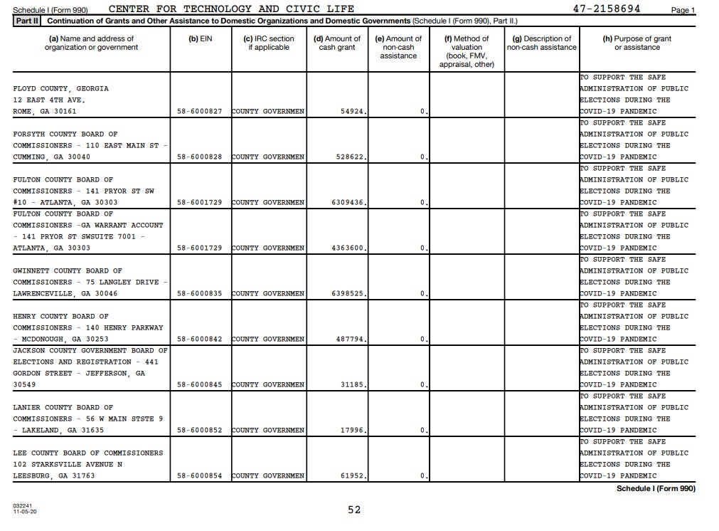
This is a sample from Georgia.
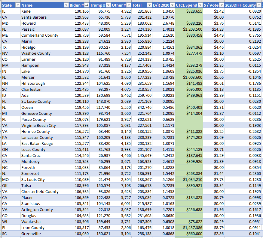
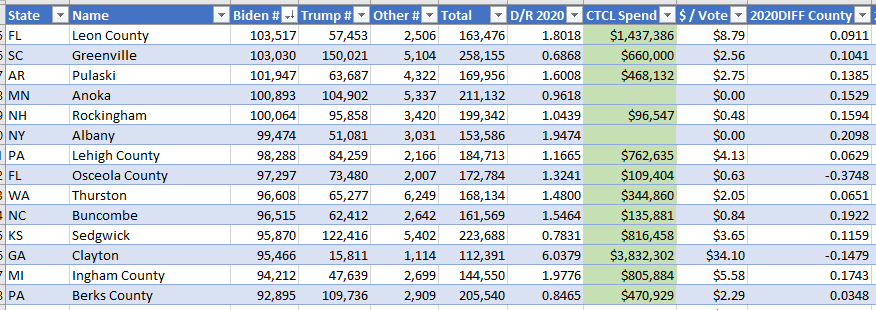
References: Sorted by D Votes Descending Order
Tranche 1: Counties receiving ~ 25% of all grants (yellow)
Tranche 2: Counties receiving ~ 50% of all grants (yellow and orange codes)
Tranche 3: Counties receiving ~ 75% of all grants (yellow, orange and green codes)